【前端】display: box布局教程 [转]
css display:box 新属性
一、display:box;
在元素上设置该属性,可使其子代排列在同一水平上,类似display:inline-block;。
二、可在其子代设置如下属性
前提:使用如下属性,必须在父代设置display:box;
1.box-flex:number;
1)占父级元素宽度的number份
2)若子元素设置固定宽度,则该子元素应用固定宽度,其他未设置固定宽度的字元素将余下的父级宽度(父级-已设置固定宽度的子代元素的总宽度按 number占份数
3)若子元素有margin值,则按余下(父级宽度-子代固定总宽度-总margin值)宽度占number份
2.box-orient:horizontal/vertical
在父级上设置该属性,则子代按水平排列或竖直排列。
注:所有主流浏览器不支持该属性,必须加上前缀。
1)horizontal 水平排列,子代总width=父级width。若父级固定宽度,则子代设置的width无效,子代会撑满父级宽度。
2)vertical 垂直排列,子代总height=父级height。若父级固定高度,则子代设置的height无效,子代会撑满父级高度。
3.box-direction:normal/reverse
在父级上设置该属性,确认子代的排列顺序。
1)normal 默认值,子代按html顺序排列
2)reverse 反序
4.box-align:start/end/center/stretch
在父级设置,子代的垂直对齐方式。
1)start 垂直顶部对齐
2)end 垂直底部对齐
3)center 垂直居中对齐
4)stretch 拉伸子代的高度,与父级设置的高度一致。子代height无效。
5.box-pack:start/end/center
在父级设置,子代的水平对齐方式。
1)start 水平左对齐
2)end 水平右对齐
3)center 水平居中对齐
display:-webkit-box
Flexbox 为 display 属性赋予了一个新的值(即 box 值), flexbox的属性有很多,记录一些比较常用的属性:
- 用于父元素的样式:
display: box; 该属性会将此元素及其直系子代加入弹性框模型中。(Flexbox 模型只适用于直系子代)box-orient:horizontal|vertical|inherit;该属性定义父元素的子元素是如何排列的。box-pack:start|end|center|justify;设置沿box-orient轴的父元素中子元素的排列方式。因此,如果box-orient是水平方向,则父元素的子元素是水平的排列方式,反之亦然。(表示父容器里面子容器的水平对齐方式--垂直排列时--定宽)box-align:start|end|center|baseline|stretch;基本上而言是box-pack的同级属性。设置框的子代在框中的排列方式。如果方向是水平的,该属性就会决定垂直排列,反之亦然。(表示父容器里面子容器的垂直对齐方式--水平排列时--定高)
- 用于子元素的样式:
- box-flex: 0 | 任意数字; 该属性让子容器针对父容器的宽度按一定规则进行划分。
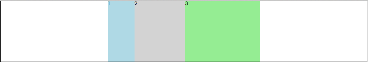
- 案例1:

 1 <style>
 2         *{
 3             margin: 0;
 4             padding: 0;
 5         }
 6         .parent{
 7             width: 500px;
 8             height: 200px;
 9             display: -webkit-box;
10             -webkit-box-orient: horizontal;/* 虽然默认的排列方式是水平的,但是为了区分起见,加上该属性 */
11         }
12         .child-one{
13             background: lightblue;
14             -webkit-box-flex: 1;
15         }
16         .child-two{
17             background: lightgray;
18             -webkit-box-flex: 2;
19         }
20         .child-three{
21             background: lightgreen;
22             -webkit-box-flex: 3;
23         }
24     </style>
25
26 <div style="display: -webkit-box;-webkit-box-pack: center;border: 1px solid #000">
27     <div class="parent">
28         <div class="child-one">1</div>
29         <div class="child-two">2</div>
30         <div class="child-three">3</div>
31     </div>
32 </div>
说明:让.parent也水平居中的话,再复用一次box属性即可;child-one占了1/6;child-two占了2/6; child-three占了3/6;
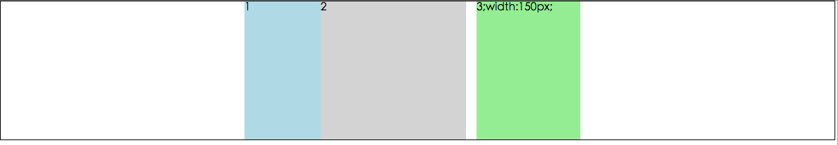
- 案例2:
<style>
        *{
            margin: 0;
            padding: 0;
        }
        .parent{
            width: 500px;
            height: 200px;
            display: -webkit-box;
            -webkit-box-orient: horizontal;/* 虽然默认的排列方式是水平的,但是为了区分起见,加上该属性 */
        }
        .child-one{
            background: lightblue;
            -webkit-box-flex: 1;
        }
        .child-two{
            background: lightgray;
            -webkit-box-flex: 2;
        }
        .child-three{
            background: lightgreen;
            /* 加了固定高度和边距 */
            width: 150px;
            margin: 0 15px;

        }
    </style>

<div style="display: -webkit-box;-webkit-box-pack: center;border: 1px solid #000">
    <div class="parent">
        <div class="child-one">1</div>
        <div class="child-two">2</div>
        <div class="child-three">3;width:150px;</div>
    </div>
</div>
说明:父容器的宽度500px减去设置了子容器的150px基础上再减去(100px+2×15px),这剩下的宽度值则按box-flex设置的值进行划分;
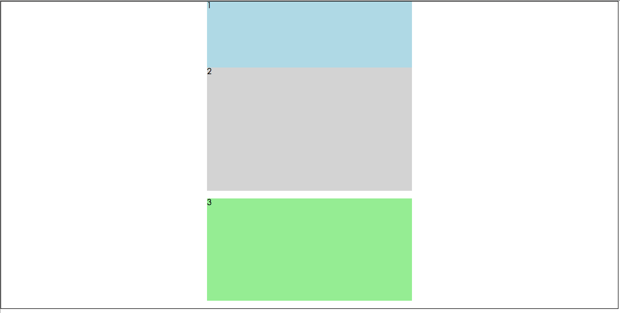
- 案例3:
<style>
        *{
            margin: 0;
            padding: 0;
        }
        .parent{
            width: 400px;
            height: 600px;
            display: -webkit-box;
            -webkit-box-orient: vertical;/* 竖向排列 */
        }
        .child-one{
            background: lightblue;
            -webkit-box-flex: 1;
        }
        .child-two{
            background: lightgray;
            -webkit-box-flex: 2;
        }
        .child-three{
            background: lightgreen;
            /* 加了固定的高度和边距 */
            height: 200px;
            margin: 15px 0;
        }
    </style>

<div style="display: -webkit-box;-webkit-box-pack: center;border: 1px solid #000">
    <div class="parent">
        <div class="child-one">1</div>
        <div class="child-two">2</div>
        <div class="child-three">3</div>
    </div>
</div>
说明:然而竖向排列跟横向排列,在原理上,并没有什么卵区别;
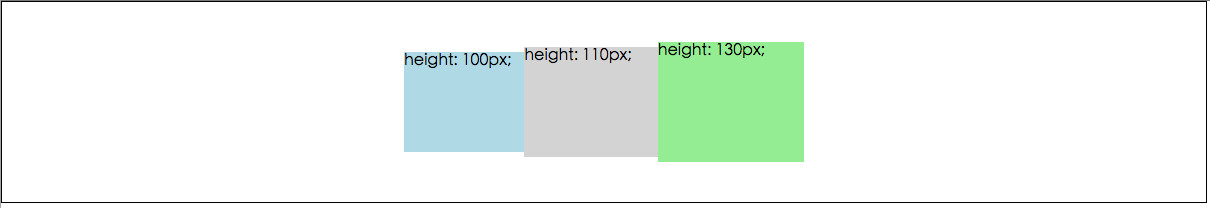
- 案例4
 <style>
        *{
            margin: 0;
            padding: 0;
        }
        .parent{
            width: 400px;
            height: 200px;
            display: -webkit-box;
            -webkit-box-orient: horizontal;
            -webkit-box-align: center; /* 水平 对应 box-align */
        }
        .child-one{
            background: lightblue;
            -webkit-box-flex: 1;
            height: 100px;
        }
        .child-two{
            background: lightgray;
            -webkit-box-flex: 2;
            height: 110px;

        }
        .child-three{
            background: lightgreen;
            -webkit-box-flex: 3;
            height: 120px;

        }
    </style>

<div style="display: -webkit-box;-webkit-box-pack: center;border: 1px solid #000">
    <div class="parent">
        <div class="child-one">height: 100px;</div>
        <div class="child-two">height: 110px;</div>
        <div class="child-three">height: 130px;</div>
    </div>
</div>
说明:在水平方向上排列时,box-align:center;定义了垂直方向的居中;
智能推荐
注意!
本站转载的文章为个人学习借鉴使用,本站对版权不负任何法律责任。如果侵犯了您的隐私权益,请联系我们删除。